Introduction
This blog will be about my experience building a simple stat layer for ggplot2. (For those not familiar, ggplot2 is a plotting library for the R programming language that his highly flexible and extendable. Layers are things like bars or lines.) |
| Figure 1: Example exploratory analysis figure |
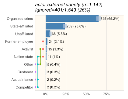
When we write the DBIR, we have automated analysis reports that slice and the data and generate figures that we look at to identify interesting concepts to write about. (See Figure 1. And Jay, if you're reading this, I know, I haven't changed it much from what you originally did.) (Also, for those wondering, 'ignored' is anything that shouldn't be in the sample size. That includes 'unknown', which we treat as 'unmeasured' and possibly 'NA' for 'not applicable.)
In Figure 1, you'll notice light blue confidence bars (Wilson binomial tests at a 95% confidence interval.) If you look at 'Former employee', 'Activist', and 'Nation-state', you can see they overlap a bit. What I wanted to do was visualize Turkey groups (similar to multicomp::plot.cld) to make it easy for myself and the other analysts to tell if we could say something like "Former employee was more common than Activist" (implying the difference is statistically significant).
First step: find documentation
The first step was actually rather hard. I looked for good blogs of others creating ggplot stats layers, but didn't turn anything up. (I'm not implying they don't exist. I'm terrible at googling.). Thankfully someone on twitter pointed me to a vignette on extending ggplot in the ggplot package. It's probably the best resource but it really wasn't enough for me to decide how to attack the problem. I also picked up ggplot2: Elegant graphics for data analysis in the hopes of using it to understand some of the ggplot2 internals. It primarily dealt with scripting ggplot functionality rather than extending it so I settled on using the example in the vignette as a reference. With that, I made my first attempt:### Attempt at making a ggplot stat for independence bars #' Internal stat to support stat_ind #' #' @rdname ggplot2-ggproto #' @format NULL #' @usage NULL #' @export StatInd <- ggplot2::ggproto("StatInd", ggplot2::Stat, required_aes=c("x", "y", "n"), compute_group = function(data, scales) { band_spacing <- -max(data$y/data$n, na.rm=TRUE) / 5 # band_spacing <- 0.1 bands <- testIndependence(data$y, data$n, ind.p=0.05, ind.method="fisher") bands <- tibble::as.tibble(bands) # Necessary to preserve column names in the cbind below bands <- cbind("x"=data[!is.na(data$n), "x"], bands[, grep("^band", names(bands), value=T)]) %>% tidyr::gather("band", "value", -x) %>% dplyr::filter(value) %>% dplyr::select(-value) y_locs <- data.frame("band"=unique(bands$band), "y"=(1:dplyr::n_distinct(bands$band))/dplyr::n_distinct(bands$band) * band_spacing) # band spacing v2 bands <- dplyr::left_join(bands, y_locs, by="band") bands[ , c("x", "y", "band")] } ) #' ggplot layer to produce independence bars #' #' @rdname stat_ind #' @inheritParams ggplot2::stat_identity #' @param na.rm Whether to remove NAs #' @export stat_ind <- function(mapping = NULL, data = NULL, geom = "line", position = "identity", na.rm = FALSE, show.legend = NA, inherit.aes = TRUE, ...) { ggplot2::layer( stat = StatInd, data = data, mapping = mapping, geom = geom, position = position, show.legend = show.legend, inherit.aes = inherit.aes, params = list(na.rm = na.rm, ...) ) }
While it didn't work, it turns out, I was fairly close. I just didn't know it.
Since it didn't work, I looked into multiple non-layer approaches including those in the book, as well as simply drawing on top of the layer. Comparing the three options I had:
- There approaches that didn't involve actually building a stat layer that probably would have worked, however they were all effectively 'hacks' for what a stack layer would have done.
- The problem with simply drawing on the layer was that the labels for the bars would not be adjusted.
- The problem with using a stat (other than it not currently working) was I was effectively drawing a discrete value (band #) onto a continuous axis (the bar height) on the other side of the axis line.
Fixing the stat layer
I decided to look at some of the geoms that exist within ggplot. I'd previously looked at stat_identity() to no avail. It turned out that was a mistake as stat_identity() basically does nothing. When I looked at stat_sum() I found what I needed. In retrospect, it was in the vignette, but I missed it. Since I was returning 'band' as a major feature, I needed to define `default_aes=ggplot2::aes(color=..band..)`. (At first I used `c(color=..band..)` though I quickly learned that doesn't work.)StatInd <- ggplot2::ggproto("StatInd", ggplot2::Stat, default_aes=ggplot2::aes(color=..band..), required_aes=c("x", "y", "n"), compute_panel = function(data, scales) { band_spacing <- -max(data$y/data$n, na.rm=TRUE) / 5 # band_spacing <- 0.1 bands <- testIndependence(data$y, data$n, ind.p=0.05, ind.method="fisher") bands <- tibble::as.tibble(bands) # Necessary to preserve column names in the cbind below bands <- cbind("x"=data[!is.na(data$n), "x"], bands[, grep("^band", names(bands), value=T)]) %>% tidyr::gather("band", "value", -x) %>% dplyr::filter(value) %>% dplyr::select(-value) y_locs <- tibble::tibble("band"=unique(bands$band), "y"=(1:dplyr::n_distinct(bands$band))/dplyr::n_distinct(bands$band) * band_spacing) # band spacing v2 bands <- dplyr::left_join(bands, y_locs, by="band") bands[ , c("x", "y", "band")] } )
With that, I had a working stat.
 |
| Figure 2: It works! |
Fixing the exploratory analysis reports
Unfortunately, our (DBIR) exploratory reports are a bit more complicated. When I added `stat_ind()` to our actual figure function (which adds multiple other ggplot2 pieces), I got:This lead a ridiculous amount of hunting. I fairly quickly narrowed it down to this line in the analysis report:
gg <- gg + ggplot2::scale_y_continuous(expand = c(0, 0), limits=c(0, yexp), labels=scales::percent) # yexp = slight increase in widthSpecifically, the `limits=c(0, yexp)` portion. Unfortunately, I got stuck there. Things I tried:
- Changing the limits (to multiple different things, both values and NA)
- Setting debug in the stat_ind() `compute_panel()` function
- Setting debug on the scale_y_continuous() line and trying to step through it
- Rereading the vignette
- Rereading other stat_* functions
- Adding the required aesthetics to the default aesthetics
- Adding group to the default aesthetics
- Google the error message
- Find it in the remove_missing() function in ggplot2
- Find what calls remove_missing(): compute_layer()
- Copy compute_layer() from the stat prototype into stat_ind(). Copy over internal ggplot2 functions that are needed by the default compute_layer() function. Hook it for debug.
- Looking at the data coming into the compute_layer() function, I see the figure below with 'y' all 'NA'. Humm. That's odd...
- Look at the data coming in without the ylimit set. This time 'y' data exists.
- Go say 'hi' to my 2yo daughter. While carrying her around the house, realize that 'y' is no longer within the limits ....
 |
| Figure 3: Data parameter into compute_layer() with ylimits set |
 |
| Figure 4: Data parameter into compute_layer() without ylimits set |
So, what happened is, when `limits=c(0, yexp)` was applied, the 'y' data was replaced with 'NA' because the large integer values of 'y' was not within the 0-1 limits. `compute_layer()` was then called, which called `remove_missing()` which removes all the rows with `NA`. This caused the removed rows.
The reason this was happening is I'd accidentally overloaded the 'y' aesthetic. `y` meant something different to ggplot than it did to testIndependence(), (the internal function which calculated the bands). The solution was to replace 'y' with 's' as a required aesthetic. Now the function looks like this:
StatInd <- ggplot2::ggproto("StatInd", ggplot2::Stat,
  default_aes=ggplot2::aes(color=..band..),
  required_aes=c("x", "s", "n"),
  compute_panel = function(data, scales) {
    band_spacing <- -max(data$s/data$n, na.rm=TRUE) / 5
    # band_spacing <- 0.1
    bands <- testIndependence(data$s, data$n, ind.p=0.05, ind.method="fisher")
    bands <- tibble::as.tibble(bands) # Necessary to preserve column names in the cbind below
    bands <- cbind("x"=data[!is.na(data$n), "x"], bands[, grep("^band", names(bands), value=T)]) %>%
      tidyr::gather("band", "value", -x) %>%
      dplyr::filter(value) %>%
      dplyr::select(-value)
    y_locs <- tibble::tibble("band"=unique(bands$band), "y"=(1:dplyr::n_distinct(bands$band))/dplyr::n_distinct(bands$band) * band_spacing) # band spacing v2
    bands <- dplyr::left_join(bands, y_locs, by="band")
    bands[ , c("x", "y", "band")]
  }
)
With that it finally started working!
 |
| Figure 5: Success! |
Conclusion
Ultimately, I really stumbled through this. Given how many new ggplot2 geoms are always popping up, I expected this to be much more straight-forward. I expected to find multiple tutorials but really came up short. There was a lot of reading ggplot2 source code. There was a lot of trial and error. In the end though, the code isn't complicated. Much of the documentation however is within the code, or the code itself. Still, I'm hoping that the first is the roughest, and the next layer I create will come more smoothly.
Hi Gabe: What's the difference between state-affiliated and nation-state?
ReplyDelete