Friday, January 26, 2018

CFP Review Ratings

Introduction


We recently completed the bsides Nashville CFP. (Thank you all who submitted.  Accepts and rejects will be out shortly.)  We had 53 talks for roughly 15 slots so it was a tough job.  I sympathize with the conferences that have in the 100's or 1,000's of submissions.

CFP Scoring


Our CFP tool provides the ability to rate talks from 1 to 5 on both content and applicability.  However, I've never been happy with how it condenses this down to a single number across all ratings.

Our best guess is it simply averages all the values of both types together.  Such ratings would look like this:
(We've removed the titles as this blog is not meant to reflect on any specific talk.)

This gives us _a_ number (the same way a physician friend of mine used to say ear-thermometers give you _a_ temperature) but is it a useful one?

First, let's use the mean instead of the median:
The nice thing about the median is it limits the effect of ratings that are way out of line.  In many of our talks, one person dislikes it for some reason and gives it a substantially lower rating than everyone else.  We see talks like 13 shoot up significantly.  It also can cause drops such as talk 51.

Scoring with a little R


But what really would be helpful is to see _all_ the ratings:
Here we can see all of the ratings broken out.  It's more complex but it gives us a better idea of what is actually happening for any one talk.  The green dot is the median for all ratings combined.  The red dots are the talks' median value.  And the grey dots are individual ratings.

We can look at 13 and see it scored basically all 5's except for for one 4 in applicability, 1 'average' rating, and one below average rating bringing the median up to 5-5.  When we look at 51, we see how it had a few slightly-below-average ratings and several below-average on content, and several below-average on both content and applicability.  We also get to compare to the mean of all talks (which is actually 4-4) rather than assuming 3-3 is average for a talk.

One I find particularly interesting is 29.  It scored average on applicability, but it's content score, which we would want to be consistently high, is spread from 1 to 4.  Not a good sign.  In the first figure, it scored a 3.2 (above average if we assume 3 is average since no average is shown).  In the median figure,  it is 3.  But in this view we can see there are significant content concerns about this talk.

Conclusion


Ultimately, we used this chart to quickly identify the talks that were above or below the mean for both content and applicability.  This let us focus our time on the talks that were near the middle and gave us additional information, in addition to the speaker's proposal and our comments, to make our decision on.  If you'd like to look at the code for the figures, you can see the jupyter notebook HERE.

Future Work


In the future I could see boiling this down to a few basic scores: content_percentile, applicability_percentile, content_score range, and applicability_score range as a quick way to automate initial scoring.  We could easily write heuristics indicating that we want content ratings to meet a certain threshold and be tightly grouped as well as set a minimum threshold for applicability.  This would let us more quickly zero in on the talks we want, (and might help larger conferences as well).

Sunday, January 7, 2018

Smaller Graphs for Easier Viewing

Introduction

As I suggested in my previous blog,  visualizing graphs is hard.  In the previous blog I took the approach of using a few visual tricks to display graph information in roughly sequential manner.  Another option is to convert the graph to a hierarchical display.  This is easy if you have a tree as hierarchical clustering or maximal entropy trees will do.

Maximal Entropy Graphs

However, our data is rarely hierarchical and so I've attempted to extend maximal entropy trees to graphs.  First, it starts with the assumption that some type of weight exists for the nodes.  However, this can simply be uniform across all nodes.  This weight is effectively the amount of information the node contains.  As in the last blog, this could be scored relative to a specific node in the graph or about any other way. It then combines nodes along edges, attempting to minimize the amount of information contained in any aggregated node.  It continues this approach until it gets to the desired number of nodes, however it keeps a history of every change so that any node can be de-aggregated.

You can find the code in this Github GIST.  You can then try it out in This Jupyter Notebook.

Ultimately, it takes a graph like this:


and produces one that looks like this:

Each node still contains all the information about the nodes and edges it aggregates.  This allows an application to dig down into a node as necessary.

Future Work

Obviously there's a lot to do.  This is less a product in and of itself than a piece for making other graph tools more useful.  As such, I should probably wrap the algorithm in a visualization application that would allow calculating per-node scores as well as diving in and out of the sub-graphs contained by each node.

Also, a method for generating aggregate summarizes of the information in each node would be helpful.  For example, if this is a maltego-type graph and a cluster of IPs and Hosts, it may make sense to name it a IP-Host node with a number of IP-Host edges included.  Alternately, if a node aggregates a path from one point to another through several intermediaries, it may make sense to note the start and endpoint, shortest path length, and intermediary nodes.  I suspect it will take multiple attempts to come up with a good name generation algorithm and that it may be context-specific.

Conclusion

In conclusion, this is another way of making otherwise illegible graphs readily consumable.  Graphs are incredibly powerful in many contexts including information security.  However methods such as this are necessary to unlock their potential.

Friday, January 5, 2018

Visualizing Graph Data in 3D

Introduction

One thing that's interested me for a while is how to visualize graphs.   There are a lot of problems with it I'll go into below.  Another is if there is a way to use 3D (and hopefully AR or VR) to improve visualization.  My gut tells me 'yes', however there's a _lot_ of data telling me 'no'.

What's so hard about visualizing graphs?

Nice graphs look like this:

This one is nicely laid out and well labeled.

However, once you get over a few dozen nodes, say 60 or so, it gets a LOT harder to make them all look nice, even with manual layout.  From there you go to large graphs:

In this case, you can't tell anything about the individual nodes and edges.  Instead you need to be able to look at a graph laid out in a certain way algorithmically and understand it.  (This one is actually a nice graph as the central cluster is highly interconnected but not too dense.  I suspect most of the outlying clusters are hierarchical in nature leading to the heavily interconnected central cluster.)

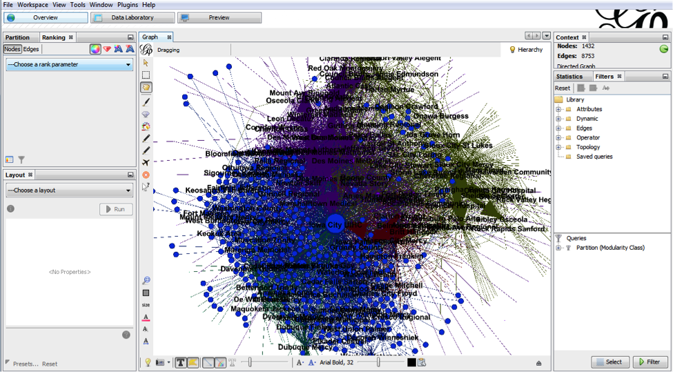
However, what most people want is to look at a graph of arbitrary size and understand things about the individual nodes.  When you do that you get something like this:


Labels overlapping labels, clusters of nodes where relationships are hidden.  Almost completely unusable.  There are some highly interconnected graph structures that look like this no matter how much you try to lay them out nicely.

It is, ultimately, extremely hard to get what people want from graph visualizations.  You can get it in special cases and with manual work per graph, but there is no general solution.

What's so hard about 3D data visualization?

In theory, it seems like 3D should make visualization better.  It adds an entire dimension of data!  The reality is, however, we consume data in 2D.  Even in the physical world, a stack of 3D bars would be mostly useless.  The 3rd dimension tells us more about the shape of the first layer of objects in front of us.  It does not tell us anything about the next layer.  As such, visualizations like this are a 2D bar chart with clutter behind them:


Even when the data is not overlapping, placing the data in three dimensions is fundamentally difficult.  In the following example, it's almost impossible to tell which points have what values on what axes:

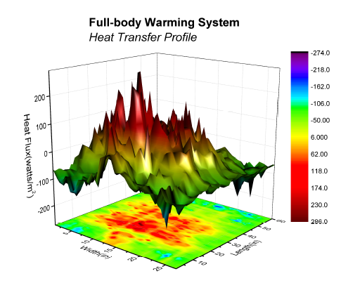
Granted, there are ways to help improve this, (mapping points to the bounding box planes, drawing lines directly down from the point to the x-y plane, etc), but in generally you would only do that if you _really_ needed that 3rd dimension (and didn't have a 4th).  Otherwise you might as well use PCA or such to project into a 2D plot.  Even a plot where the 3rd dimension provides some quick and easy insight, can practically be projected to a 2D heatmap:


Do you really need to visualize a graph?

Many times when people want to visualize a graph, what they really want is to visualize the data in the graph in the context of the edges.  Commonly, graph data can be subsetted with some type of graph transversal (e.g. [[select ip == xxx.xxx.xxx.xxx]] -> [[follow all domains]] <- [[return all ips]]) and the data returned in a tabular format.  This is usually the best approach if you are past a few dozen nodes. Even if long, this data can easily be interpreted as many types of figures (bar, line, point charts, heatmaps, etc).  Seeing the juxtaposition between visualizing graphs because they were graphs, but when the data desired was really tabular heavily influenced how I approached the problem.

My Attempt

First, I'll preface this by saying this is probably a bad data visualization.  I have few reasons to believe it's a good one.  Also, it is extremely rough; nothing more than a proof of concept. Still, I think it may hold promise.


The visualization is a ring of tiles.  Each tile can be considered to be a node.  We'll assume each node has a key, a value, and a score. There's no reason there couldn't be more or less data per node, but the score is important.  The score is "how relevant a given node is to a specified node in the graph.  This data is canned, but in an actual implementation, you might search for a node representing a domain or actor.  Each other  node in the graph would then be scored by relevance to that initial node.  If you would like ideas on how to do this, consider my VERUM talk at bsidesLV 2015. For now we could say it was simply the shortest path distance.

One problem with graphs is node text.  It tends to not fit on a node (which is normally drawn as a circle).  In this implementation, the text scrolls across the node rectangle allowing quick identification of the information and detailed consumption of the data by watching the node for a few seconds.  All without overlapping the other nodes in an illegible way.

Another problem is simply having two many nodes on screen at once time.  This is solved by only having a few nodes clearly visible at any given time (say the front 3x3 grid).  This leads to the question of how to access the rest of the data.  The answer is simply by spinning the cylinder.  The farther you get from node one (or key1 in the example), the less relevant the data.  In this way, the most relevant data is also presented first.

You might be asking how much data this can provide.  A quick look says there are only 12 columns in the cylinder resulting in 36 nodes, less than even the 60 we discussed above.  Here we use a little trick.  As nodes cross the centerline on the back side, they are actually replaced.  This is kind of like a dry-cleaning shop where you can see the front of the clothing rack, but it in fact extends way back into the store.  In this case, the rack extends as long as we need it to, always populated in both directions.

Demo


I highly recommend you try out the interactive demo above.  it is not pretty.  The data is a static json file, however that is just for simplicity.

Future Work

Obviously there's many things that can be done to improve it:
  • A search box can be added to the UI and a full back end API to populate the visualization from a graph.
  • Color can be added to identify something about the nodes such as their score relative to the search node or topic.
  • The spacing of the plane objects and camera can be adjusted.
  • Multiple cylinders could exist in a single space at the same time representing different searches.
  • The nodes could be interactive.
  • The visualizations could be located in VR or AR.
  • Nodes could be selected from a visualization and the sub-graph returned in a more manageable size (see the 60ish node limit above). These subgraphs could be stored as artifacts to come back to later.
  • The camera could be within the cylinder rather than outside of it.

Conclusion

I'll end the same way I began.  I have no reason to believe this is good.   It is, at least, an attempt to address issues in graph visualization.  I look forward to improving on it in the future.

Building a SEIM Dashboard with R, Jupyter, and Logstash/Elastic Search

Motivation:

I am disappointed with the dashboards offered by today's SEIMs.  SEIM dashboards offer limited data manipulation through immature, proprietary query languages and limited visualization options. Additionally, they tend to have proprietary data stores that limit expansion and evolution to what the vendor supports.  Maybe I'm spoiled by working in R and Rstudio for my analysis, but I think we can do better.

Plan:

This blog is mainly going to be technical steps vs a narrative.  It is also not the easiest solution.  The easiest solution would be to already have the ELK stack, install interact.io, R, the R libraries, and the R jupyter kernel on your favorite desktop, and connect.  That said, I'm going to walk through the more detailed approach below.  You can view the example notebook HERE.  Make sure to scroll down to the bottom where the figures are as it has a few long lists of fields.

Elastic search is becoming more common in security, (e.g. 1, e.g. 2).  Combine that with the elastic package for R, and that should bring all of the great R tools to our operational data.  Certainly we can create regular reports using Rmarkdown, but can we create a dashboard?  Turns out with Jupyter you can!  To test it out, I decided to stand up a Security Onion VM, install everything needed, and build a basic dashboard to demonstrate the concept.

Process:

Install security onion:

Security onion has an EXCELLENT install process.  Simply follow that.

Install R:


Added ‘deb https://mirrors.nics.utk.edu/cran/bin/linux/ubuntu trusty/‘ to packages list

sudo apt-get install r-base

sudo apt-get install r-base-dev

— based off r-project.org

Install R-studio (not really necessary but not a bad idea)


Downloaded r-studio package from R-studio and installed

Sudo apt-get install libjpeg62

sudo dpkg -I package.deb

Install Jupiter:


(https://www.digitalocean.com/community/tutorials/how-to-set-up-a-jupyter-notebook-to-run-ipython-on-ubuntu-16-04)

Sudo apt-get install python-pip

sudo pip install —upgrade pip (required to avoid errors)

sudo -H pip install jupyter 

Install Jupyterlab: (probably not necessary)


Sudo -H pip install jupyterlab

Sudo jupyter serverextension enable --py jupyterlab --sys-prefix

Install Jupiter dashboard

(https://github.com/jupyter/dashboards)

sudo -H pip install jupyter_dashboards

sudo -H pip install --upgrade six

Sudo jupyter dashboards quick-setup --sys-prefix 

Install R packages & Jupypter R kernel:

Sudo apt-get install libcurl4-openssl-dev

sudo apt-get install libxml2-dev

Start R

install.packages("devtools") # (to install other stuff)

install.packages(“elastic”) # talk to elastic search

install.packages(“tidyverse”) # makes R easier

install.packages("lubridate") # helps with working with dates

install.packages("ggthemes") # has good discrete color palettes

install.packages("viridis") # has great continuous colors

# https://github.com/IRkernel/IRkernel

devtools::install_github('IRkernel/IRkernel')

# or devtools::install_local('IRkernel-master.tar.gz')

IRkernel::installspec() # to register the kernel in the current R installation

quit() # leave. Answer ’n’ to the question “save workspace?”

Install nteract: (Not necessary)

(nteract.io)

Download the package

Sudo apt-get install libappindicator1 libdbusmenu-gtk4 libindicator7

sudo dpkg -i nteract_0.2.0_amd64.deb


Set up the notebook:

Rather than type this all out, you can download an example notebook.  In case you don't have an ES server populated with data, you can download this R data file which is a day of windows and linux server logs queried from ES from a blue vs red CTF.

I created the notebook using nteract.io so it is in a single order.  However, if you open it on the juypter server, you can use the dashboards plugin to place the cells where you want them in a dashboard.

Results:

A lot of time spent compiling.

No need to download R/jupyter stuff on security onion if elastic search is remotely reachable.

Elastic search is not intuitive to query.  Allowing people an 'easy mode' to generate queries would be significantly helpful.  the `ES()` function in the workblook is an attempt to do so.

It would be nice to be able to mix interactive and dashboard cells.

This brings MUCH more power for both analysis _and_ visualization to the dashboard.

This brings portability, maintainability (ipynb files can be opened anywhere that has the R/jupyter environment and can access elastic search.  They can also be forked, version controlled, etc.)

Future Work:

Need a way to have cells refresh every few minutes, likely a jupyter notebook plugin.

Interactive figures require interactive plotting tools such as Vega.  This would also bring the potential ability to stream data directly to the notebook.  It may even solve the ability to auto-refresh.

Conclusion:

In conclusion, you really don't want to roll-your-own-SEIM.  That said, if you already have ES (or another data store R can talk to) in your SEIM and want less lock-in/more analysis flexibility, R + Jupyter may be a fun way to get that extra little emph.  And hopefully in the future we'll see SEIM vendors supporting general data science tools (such as R or Python) in their query bars and figure grammars (ggplot, vega, vegalite), in their dashboards.

Monday, September 18, 2017

Building a ggplot2 stat layer

Introduction

This blog will be about my experience building a simple stat layer for ggplot2.  (For those not familiar, ggplot2 is a plotting library for the R programming language that his highly flexible and extendable.  Layers are things like bars or lines.)
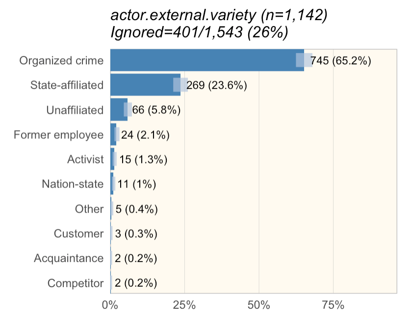
Figure 1: Example exploratory analysis figure

When we write the DBIR, we have automated analysis reports that slice and the data and generate figures that we look at to identify interesting concepts to write about. (See Figure 1.  And Jay, if you're reading this, I know, I haven't changed it much from what you originally did.) (Also, for those wondering, 'ignored' is anything that shouldn't be in the sample size.  That includes 'unknown', which we treat as 'unmeasured' and possibly 'NA' for 'not applicable.)

In Figure 1, you'll notice light blue confidence bars (Wilson binomial tests at a 95% confidence interval.) If you look at 'Former employee', 'Activist', and 'Nation-state', you can see they overlap a bit.  What I wanted to do was visualize Turkey groups (similar to multicomp::plot.cld) to make it easy for myself and the other analysts to tell if we could say something like "Former employee was more common than Activist" (implying the difference is statistically significant).

First step: find documentation

The first step was actually rather hard.  I looked for good blogs of others creating ggplot stats layers, but didn't turn anything up.  (I'm not implying they don't exist.  I'm terrible at googling.). Thankfully someone on twitter pointed me to a vignette on extending ggplot in the ggplot package.  It's probably the best resource but it really wasn't enough for me to decide how to attack the problem.  I also picked up ggplot2:  Elegant graphics for data analysis in the hopes of using it to understand some of the ggplot2 internals.  It primarily dealt with scripting ggplot functionality rather than extending it so I settled on using the example in the vignette as a reference.  With that, I made my first attempt:


### Attempt at making a ggplot stat for independence bars
#' Internal stat to support stat_ind
#' 
#' @rdname ggplot2-ggproto
#' @format NULL
#' @usage NULL
#' @export
StatInd <- ggplot2::ggproto("StatInd", ggplot2::Stat,
  required_aes=c("x", "y", "n"), 
  compute_group = function(data, scales) {
    band_spacing <- -max(data$y/data$n, na.rm=TRUE) / 5
    # band_spacing <- 0.1
    bands <- testIndependence(data$y, data$n, ind.p=0.05, ind.method="fisher")

    bands <- tibble::as.tibble(bands) # Necessary to preserve column names in the cbind below
    bands <- cbind("x"=data[!is.na(data$n), "x"], bands[, grep("^band", names(bands), value=T)]) %>%
      tidyr::gather("band", "value", -x) %>%
      dplyr::filter(value) %>%
      dplyr::select(-value)
    y_locs <- data.frame("band"=unique(bands$band), "y"=(1:dplyr::n_distinct(bands$band))/dplyr::n_distinct(bands$band) * band_spacing) # band spacing v2
    bands <- dplyr::left_join(bands, y_locs, by="band")
    bands[ , c("x", "y", "band")]
  }
)


#' ggplot layer to produce independence bars
#' 
#' @rdname stat_ind
#' @inheritParams ggplot2::stat_identity
#' @param na.rm Whether to remove NAs
#' @export
stat_ind <- function(mapping = NULL, data = NULL, geom = "line", 
                     position = "identity", na.rm = FALSE, show.legend = NA,
                     inherit.aes = TRUE, ...) {
  ggplot2::layer(
    stat = StatInd, data = data, mapping = mapping, geom = geom,
    position = position, show.legend = show.legend, inherit.aes = inherit.aes,
    params = list(na.rm = na.rm, ...)
  )
}


While it didn't work, it turns out, I was fairly close.  I just didn't know it.

Since it didn't work, I looked into multiple non-layer approaches including those in the book, as well as simply drawing on top of the layer.  Comparing the three options I had:

  • There approaches that didn't involve actually building a stat layer that probably would have worked, however they were all effectively 'hacks' for what a stack layer would have done.  
  • The problem with simply drawing on the layer was that the labels for the bars would not be adjusted. 
  • The problem with using a stat (other than it not currently working) was I was effectively drawing a discrete value (band #) onto a continuous axis (the bar height) on the other side of the axis line.  
Ultimately I decided to stick with this though it's technically anti-ggplot to mix axes.  (In the Tukey plot, the 'band' is technically a categorical variable, however we are plotting it on the long side of the bars, which is discrete.)

Fixing the stat layer

I decided to look at some of the geoms that exist within ggplot.  I'd previously looked at stat_identity() to no avail.  It turned out that was a mistake as stat_identity() basically does nothing.  When I looked at stat_sum() I found what I needed.  In retrospect, it was in the vignette, but I missed it.  Since I was returning 'band' as a major feature, I needed to define `default_aes=ggplot2::aes(color=..band..)`.  (At first I used `c(color=..band..)` though I quickly learned that doesn't work.)


StatInd <- ggplot2::ggproto("StatInd", ggplot2::Stat,
  default_aes=ggplot2::aes(color=..band..),
  required_aes=c("x", "y", "n"),
  compute_panel = function(data, scales) {
    band_spacing <- -max(data$y/data$n, na.rm=TRUE) / 5
    # band_spacing <- 0.1
    bands <- testIndependence(data$y, data$n, ind.p=0.05, ind.method="fisher")
    bands <- tibble::as.tibble(bands) # Necessary to preserve column names in the cbind below
    bands <- cbind("x"=data[!is.na(data$n), "x"], bands[, grep("^band", names(bands), value=T)]) %>%
      tidyr::gather("band", "value", -x) %>%
      dplyr::filter(value) %>%
      dplyr::select(-value)
    y_locs <- tibble::tibble("band"=unique(bands$band), "y"=(1:dplyr::n_distinct(bands$band))/dplyr::n_distinct(bands$band) * band_spacing) # band spacing v2
    bands <- dplyr::left_join(bands, y_locs, by="band")
    bands[ , c("x", "y", "band")]
  }
)


With that, I had a working stat.

Figure 2: It works!

Fixing the exploratory analysis reports

Unfortunately, our (DBIR) exploratory reports are a bit more complicated.  When I added `stat_ind()` to our actual figure function (which adds multiple other ggplot2 pieces), I got:


This lead a ridiculous amount of hunting.  I fairly quickly narrowed it down to this line in the analysis report:
gg <- gg + ggplot2::scale_y_continuous(expand = c(0, 0), limits=c(0, yexp), labels=scales::percent) # yexp = slight increase in width
Specifically, the `limits=c(0, yexp)` portion.  Unfortunately, I got stuck there.  Things I tried:
  • Changing the limits (to multiple different things, both values and NA)
  • Setting debug in the stat_ind() `compute_panel()` function
  • Setting debug on the scale_y_continuous() line and trying to step through it
  • Rereading the vignette
  • Rereading other stat_* functions
  • Adding the required aesthetics to the default aesthetics 
  • Adding group to the default aesthetics
What finally worked with this:
  1. Google the error message
  2. Find it in the remove_missing() function in ggplot2
  3. Find what calls remove_missing(): compute_layer()
  4. Copy compute_layer() from the stat prototype into stat_ind().  Copy over internal ggplot2 functions that are needed by the default compute_layer() function.  Hook it for debug.
  5. Looking at the data coming into the compute_layer() function, I see the figure below with 'y' all 'NA'.  Humm.  That's odd...
  6. Look at the data coming in without the ylimit set.  This time 'y' data exists.
  7. Go say 'hi' to my 2yo daughter.  While carrying her around the house, realize that 'y' is no longer within the limits ....
Figure 3: Data parameter into compute_layer() with ylimits set
Figure 4: Data parameter into compute_layer() without ylimits set
So, what happened is, when `limits=c(0, yexp)` was applied,  the 'y' data was replaced with 'NA' because the large integer values of 'y' was not within the 0-1 limits.  `compute_layer()` was then called, which called `remove_missing()` which removes all the rows with `NA`.  This caused the removed rows.

The reason this was happening is I'd accidentally overloaded the 'y' aesthetic.  `y` meant something different to ggplot than it did to testIndependence(), (the internal function which calculated the bands).  The solution was to replace 'y' with 's' as a required aesthetic.  Now the function looks like this:


StatInd <- ggplot2::ggproto("StatInd", ggplot2::Stat,
  default_aes=ggplot2::aes(color=..band..), 
  required_aes=c("x", "s", "n"), 
  compute_panel = function(data, scales) {
    band_spacing <- -max(data$s/data$n, na.rm=TRUE) / 5
    # band_spacing <- 0.1
    bands <- testIndependence(data$s, data$n, ind.p=0.05, ind.method="fisher")
    bands <- tibble::as.tibble(bands) # Necessary to preserve column names in the cbind below
    bands <- cbind("x"=data[!is.na(data$n), "x"], bands[, grep("^band", names(bands), value=T)]) %>%
      tidyr::gather("band", "value", -x) %>%
      dplyr::filter(value) %>%
      dplyr::select(-value)
    y_locs <- tibble::tibble("band"=unique(bands$band), "y"=(1:dplyr::n_distinct(bands$band))/dplyr::n_distinct(bands$band) * band_spacing) # band spacing v2
    bands <- dplyr::left_join(bands, y_locs, by="band")
    bands[ , c("x", "y", "band")]
  } 
)

With that it finally started working!

Figure 5: Success!

Conclusion

Ultimately, I really stumbled through this.  Given how many new ggplot2 geoms are always popping up, I expected this to be much more straight-forward.  I expected to find multiple tutorials but really came up short.  There was a lot of reading ggplot2 source code.  There was a lot of trial and error.  In the end though, the code isn't complicated.  Much of the documentation however is within the code, or the code itself.  Still, I'm hoping that the first is the roughest, and the next layer I create will come more smoothly.

Wednesday, September 13, 2017

The end of risk

Introduction

I think risk is hurting infosec and may need to go.

First, a quick definition of risk:

Risk is the probable frequency and probable magnitude of future loss.
(Note: If this is not your definition of risk, the rest of the blog is probably going to make much less sense.  Unfortunately why this is the definition of risk is outside the scope of this blog so will have to wait.)

In practicality, risk is a way to measure security by measuring the likelihood and impact of something bad happening that could have been prevented by information security.

Outcomes

That last line is a bit nebulous though right?  Risk measures the opposite of what we're doing.  So let's better define what we're doing.  Let's call what we're doing an outcome: the end result of our structure and processes (for example, in healthcare, heart disease is a general term for negative cardiovascular outcomes).  Next, let's define what we want:
(A statistically insignificant and heavily biased survey. Obviously.  Why is this a good outcome? See the addendum.)

Measures, Markers, and Key Risk Indicators

Where we can directly measure this outcome, we call it a 'measure' (for example ejection fraction for heart disease) and life is a lot easier.  For risk we have to use surrogate markers (for example cholesterol for heart disease), sometimes called a Key Risk Indicators in risk terms.  Now when we say 'risk', we normally mean the indicators we use to predict risk.  The most well respected methodology is FAIR though if you are currently using an excel spreadsheet with a list of questions for your risks, you can easily improve simply by switching to Binary Risk Assessment.

The problems with risk.

The first problem with risk is not with risk per se, but with the surrogate markers we measure to predict risk.  In other fields such as medicine, before using a surrogate marker, there would be non-controversial studies linking the surrogate marker and the outcome.  In security, I'm not aware of any study which shows that the surrogate markers we measure to determine risk, actually predict the outcome in a holistic way.  In my opinion, there's a specific reason:
Because there are more legitimate targets than attackers, what determines an organization's outcome (at least on the attack side) is attacker choice.
You can think of it like shooting fish in a barrel.  Your infosec actions may take you out of the barrel, but you'll never truly know if you're out of the barrel or your in the barrel and just weren't targeted.   This, I think, is the major weakness in risk as a useful marker of outcomes.

This ignores multiple additional issues with risk such as interrelationships between risks, the impact of rational actors, and difficulty in capturing context, let alone problems in less mature risk processes that are solved in mature processes such as FAIR.

The second problem with risk is related to defense:
Risk does not explicitly help measure minimization of defense.  It tells us nothing about how to decrease (or minimally increase) the use of resources in infosec defense.   
I suspect we then implicitly apply an equation that Tim Clancy brought to my attention as foundational in the legal field: Burden < Cost of Injury × Probability of occurrence, (i.e. if Burden < Risk, pay the burden). It sounds good in theory, but is fraught with pitfalls.  The most obvious pitfall is that it doesn't scale.  Attacks are paths, except the paths are not in isolation.  At any given step, they can choose to go left or right, in effect creating more paths than can be counted.  As such, while one burden might be affordable, the sum of all burdens would bankrupt the organization.

What happens when markers aren't linked to outcomes?

As discussed in this thread, I think a major amount of infosec spending is socially driven.  Either the purchaser is making a purchase to signals success ("We only use the newest next gen products!"), signal inclusion in a group ("I'm a good CISO"), or is purchasing due to herd mentality ("Everyone else buys this so it must be the best option to buy").  Certainly, as we've shown above, the spending is not related to the outcome.  This begs the question of who sets the trends for the group or steers the herd.  I like Marcus Carey's suggestion: The analysts and Value Added Resellers. Maybe this is why we see so much marketing money in infosec.

The other major driver is likely other surrogate markers.  Infosec decision makers are starved for concrete truth, and so almost any number is clung to.  The unfortunate fact is that, like risk, most of these numbers have no demonstrable connection to the outcome.  Take hypothetical threat intelligence solution for example.  This solution includes all IPv4 addresses as indicators.  It has a 100% success rate in identifying threats.  (It also has a near 100% false positive rate.)  I suspect, with a few minor tweaks, it would be readily purchased even though it adds no value.

What can we do?

There are three questions we need to ask ourselves when evaluating metrics/measures/surrogate markers/KRI/however you refer to them.  From here on out, I'll refer to 'them' as 'metrics'.
  1. What is the outcome?
  2. Why is this the right outcome? (Is it actionable?)
  3. How do you know the metric is predicting this outcome?
For any metric you are considering using to base your security strategy on (the metric you use to make decisions of projects, purchases, etc with), you should be able to answer these three questions definitively.  (In fact, this blog answers the first question and part of the second above in the first section.)  I think there are at least three potential areas for future research that may yield acceptable metrics.

Operational metrics

I believe operational metrics have a lot of potential.  They are easy to collect with a SEIM.  The are actionable.  They can directly predict the outcome above.  ("The ideal outcome of infosec is minimizing infosec, attack and defense.")  Our response process:

  1. Prevent
  2. Detect
  3. Respond
  4. Recover

should minimize infosec.  With that in mind we can measure it:

  • Absolute count of detections. (Should go down with mitigations.)
  • Time to detect (Should go down with improved detection.) (Technically, absolute count of detections should go up with improved detection as well, but should also be correlated with an improved time to detect)
  • Percent detected in under time T.  (Where time T is set such that, above time T, the attack likely succeeded.)
  • Percent responded to. (Depending on the classification of the incidents, this can tell you both how much time you are wasting responding to false positives and what portion of true attacks are are resolving.)
  • Time to respond. (Goal of responding in under T where T represents time necessary for the attack to succeed.)
  • Successful response. (How many attacks are you preventing from having an impact)
The above metrics are loosely based on those Sandia National Labs uses in physical security assessments.  You can capture additional resource-oriented metrics:
  • Time spent on attacks by type.  (This can help identify where your resources are being spent so you can prioritize projects to improve resource utilization)
  • Recovery resources used. (This can help assess the impact of failure in the Detect and Respond metrics.)
  • Metrics on escalated incidents. (Time spent at tier 1, type, etc.  This may suggest projects to minimize tier 2 use and, therefore, overall resource utilization.)

Combine this with data from infosec projects and other measurable infosec resource costs and the impact of infosec on the organization (both attack and defense) can be measured.

Relative risk

Risk has a lot of good qualities.  One way to get around it's pitfalls may be to not track risk in absolute terms (probability of impact size in FAIR's case), but in relative terms.  Unfortunately, it removes the ability to give the business a single, "this is your risk" score except in terms relative to other organizations.  But relative may be enough,.  For implementing a security strategy where the goal is to pick the most beneficial course of action, relative risk may be enough to choose a course of action.  The actions can even have defensive costs associated with them as well.  The problem is that the defensive costs and the relative risk are not in the same units, making it hard to understand if purchasing a course of action is a net benefit.

Attacker cost

Finally, I think attacker cost may be a worthwhile area of research.  However, I don't think it is an area that has been well explored.  As such, a connection between maximizing attacker cost and "minimizing infosec" (from our outcome) has not been demonstrated.  I suspect a qualified economist could easily show that as attacker costs go up, some attackers will be priced out of the market, and those that still could afford to attack, will choose less expensive sources to fulfill their needs.  However a qualified economist, I am not.  Second, I don't know that we have a validated way to measure attack 'cost'.  It makes intuitive sense that we could estimate these costs.  (We know how they are done and, as such, can estimate what it would cost us to accomplish the attack and any differences between us and attackers.) But before this is accepted, academic research in pricing attacks will be necessary.

Conclusion

So, from this blog, I want you to take a two things:
  1. The fact that attackers pick targets means no-one really knows if their mitigations make them secure.
  2. Three easy questions to ask when looking at metrics to guide your organization's security strategy
With a well-defined outcome, and good metric(s) to support it, you can truly build a data-driven security strategy.  But that's a talk for another day.

Addendum

Why is this the right outcome?  Good question.  It captures multiple things at once.  Breaches can be considered a cost associated with infosec and so are captured.  However, it'd be naive to think that all costs attackers cause are associated with breaches (or even incidents).  The generality of the definition allows it to be inclusive.  It also captures the flip side: the goal of minimizing defenses. This is easy to miss, but critical to organizations.  There is no benefit to infosec if the cost of stopping attacks is worse than the cost of the attacks.  Ideally, stopping attacks would have zero cost of resources (though that is practically impossible).  This outcome is also vague about the unit to be minimized allowing flexibility.  (It doesn't say 'minimize cost' or 'minimize time'.) Ultimately it's up to the organization to measure this outcome.  How they choose to do so will determine their success.

Thursday, August 24, 2017

The Haves and the Have-Nots - Automation of Infosec

Several years ago, I blogged about Balkanizing the Internet. More than ever it appears that a digital feudalism is emerging.  A driver that I didn't necessarily consider is the automation of security.

Automation in Infosec

The future of security is speed and persuasiveness.  Whoever accomplishes the OODA loop (or additive factors if you like) first has an incredible advantage.  In information security, that means automation and machine learning making contextual decisions faster than humans ever could.  It will be defense's algorithms against offense's.  The second part is probably more interesting.  Machine learning is output generated from input.  In essence, humans are a much less predictable version of the same.  As such, any actor or algorithm, offensive or defensive, that can figure out what input to the opposing side produces the outcome they want, and provide that input before losing will win.  Because it needs to happen at speed, it's also likely to be algorithmic.  We already train adversarial models to do this.

Infosec 1%'ers

The need for speed and persuasiveness driving automation and artificial intelligence in information security is it's own blog.  I touch on it here because, in reality, it only describes the infosec 1%'ers. While a Google or Microsoft may be able to guard their interests with robust automation and machine learning, the local app developer, law office, or grocery store will not.

Which brings us to the recent malware.  It should be a wake-up call to all information security professionals.  It utilizes no new knowledge, but it provides a datapoint in the trend of automation. While the 1%, or even 50% defender might not be affected, the publicly known level of automation in infosec attack is easily ahead of a large portion of the internet and appears to be growing faster than defensive automation due to adherence to engineering practices for system management.  Imagine malware automating the analysis process in bloodhound.  Imagine an attack graph, knowledgeable about how to turn emails/credentials/vulnerabilities into attacks/malware, and malware/attacks into email/credentials, was built into a piece of malware, causing it to spread, unhindered as it creeps across the trust relationships that connect everyone on the planet.  This could easily be implemented as a plugin for a tool such as armitage.

Balkanization

This is brings us back to the Balkanization of the Internet.  In the near future, the only way to defend systems may be to cede control, regardless of the obligations, to the infosec 1%ers'.  The only people protected will be those who allow automated systems to guard, modify, and manage their systems.  Your choice may be to allow google to monitor all traffic on your internal network to allow their models to defend it, or quickly fall victim to roving automated threats.  The internet will have devolved into roaming threats, only kept at bay by feudal lords able to oppose them.